Posts
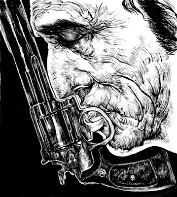
Almost Final Ill
So this is almost the final for the gun obsessed guy illustration. I still might try to find a way to and some color in there, but it gets tricky when I already add most of the value with the inking.

Card Layout + Corporate Identity
Heres some rough concepts for my letterhead, porftolio page and envelope design. Not really sure about them, they'll definetely go through alot more change before final.


And here's a basic rough layout of what my business card might look like. I'm trying to keep it really simple and informative. Just stick to the basics.


start of a new ill
This is the start of a new illustration. We had to come up with a drawing to illustrate a story, It's kinda long so I can't really go into alot of detail. The gist of it is about a father and a son's relation ship that focused around hunting and the father's obsession with guns. And there's a divorce, they grow apart and the dad kills himself. Kid inherets all the guns, regrets their relationship and goes a little nuts. Something along those lines, hope i didn't spoil the story for anyone.So my original idea was going to be a small silhouette of the son walking into the woods with his rifle while in the background the a huge looming profile of his dad which is made out of guns. In the end my teacher decided that the face made out of guns was a strong enough image to stand on its own.
Here's the base ink drawing of the dad.
 And here's a rough test of how I might incorporate the guns into his head. It's too subtle though. I'm going to try and look for ways to convert larger shapes on the face into gun form.

Lambo Gangstas
This is a piece made for an article about modern muscle cars. I chose the Lamborghini Murcielago because it was the coolest looking out of all the ones we had to choose from.The concept for this illustration started as a kind of biker gang, but replacing the tough guys with nerdy, old business executives and of course replacing the Harleys with the cars. In the end it didn't work out exactly how I intended but it still portrays the same basic concept I was going for. I just wanted to show how the cars are a very strong status symbols and how it makes the owners feel.

Im still trying to figure out exactly how i want to finish it. I hadn't intended it to be an ink piece but time was running short and it's the fastest way I can make a final. I would have preferred to do it in acrylics but that'll have to be for another time. This version will probably be finished digital.
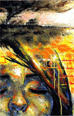
Dorothy of Oz
This was our final assignment for illustration, it was an open assignment. I was kinda burned out already since it was the end of the semester. Plus, I've never really liked open assignments. It's a lot more fun trying to figure out something fun to do with a strict assignment.Either way I decided I wanted to find an interesting story that was part of public domain. Something I could interpret in a different way but it was still recognizable. Wizard of Oz seemed like a good choice.
Originally I was going to try and go for a Sci-FI look, or a "Heavy Metal" interpretation. Something crazy and wild. But none of those ideas stuck with the teacher or with me.
In the end I decided on going with a more abstract and impressionistic approach, on both the painting style and the concept. The top represents Kansas, I kept it kinda monotone to match how in the movie it starts out in black and white. Then on the bottom I have her in full vibrant colors because Oz is magical and stuff. Also added the yellow brick road behind her.
I think so far this is one of my favorite pieces to look at.
