Posts

Samus Aran
A quick sketch portrait of Samus Aran for #Sketch_Dailies posted originally on my twitter for their daily sketch challenges.Here's the black and white version wanted to keep it simple and strong and decided to try out a bit of a textured crosshatched background.
For the color version to keep with the background style I tried to keep the same crosshatch style to give it a comic book, pop art feel.

It was a good way to to save on time with out getting into heavy rendering. I'll probably still going in to it at a later time to give some more detail, rendering and attention to her mechanical parts.
I usually post my #sketch_dailies on my twitter when I get around to them, or even on my fb page.

Batman Beyond
This was an ink warm-up to loosen up for some other projects in the works. Plus I just started playing around in Manga Studio, so this was done mostly in there to give it a test run. Plus I love Batman Beyond and just finished reading through the whole comic run, which was very true to the show and expanded it's world, but still managed to be great in it's own right.
Anyways, there are definitely a lot of benefits in Manga Studio. Mainly the ink brushes are so smooth and precise compared to Photoshop. They're really fast and responsive, I was able to go from sketch to final in no time. I'm sure there's tweaking and brush downloads available to get a similar effect in PS, but I'm really digging Manga Studio for now.
Not saying I completely switched over either. MS is really fast for drawing, laying down lines and get it sharp and crisp. But I still finished up the fine details and shading in PS, plus the color and the background.

Here's a close up detail shot.
PS and MS both have their own strengths, the trick is gonna be figuring a good work flow to take advantage of all of them.
Follow on // Facebook // for more updates!

Hellboy
I started doing a series of my own personal comic icons, mostly characters or creators who I really admire for their style and vision. I couldn't pass up Mike Mignola's Hellboy, they both ooze style.
I started with a quick sketch. I wanted to keep the lines clean and fresh, with big shapes. I didn't want to completely ape Mignola's style, just use it as inspiration.
I knew from the start it was going to be a digital piece and sometimes starting a sketch digitally gets too messy for me. I've also been trying to streamline my process. So I just sketched it out, took a quick picture, and redrew the whole thing digitally.
Since sometimes scanning forces me to try to save the original line work, I wanted a photo so it pushes me to recreate crisp lines.

Here's the finished linework. Mostly cleanup and blocking in the empty shapes. Plus he needed his iconic BPRD patch.
I tried no to get to crazy with the detail, here's a bit of a close up shot.

And onto the color! The color was a bit of a head scratcher for me, I wanted to find a nice balance between flat colors like the comic, but just enough detail to set off the linework.

And that's about it. Trying to keep the linework and detail minimal was crucial for the color not to become overpowering in the end.
Prints Available as well!
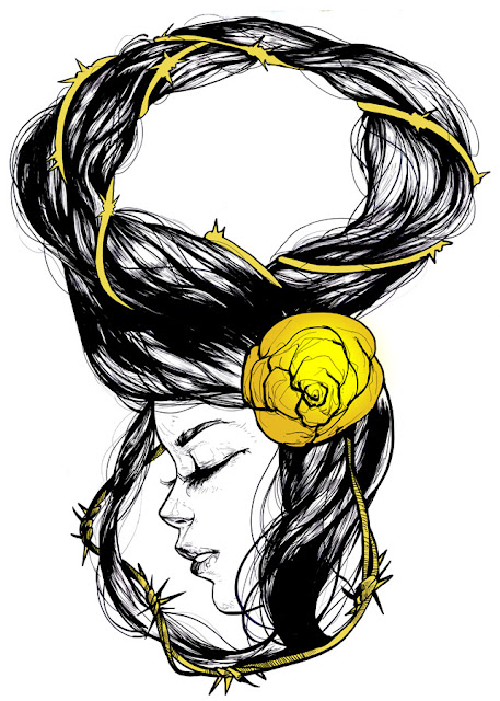
ROSE THORN
So, a lot of stuff has been going on. Thanks to Art in the Park I met a business partner that runs a clothing factory and wants to work together with SuarezArt to bring some new life, fresh blood, and sick art to his business.We've been building some brands and clothing lines, I think I've drawn more these last 3 weeks than I have my whole life. I don't know if that says something about how much work I've done now, or how lazy I was then...
Anyways most of the stuff is hush hush but I will post the things that are Suarezart related.

This girl was drawn on my first day in. I just went at it like no tomorrow.
We wanted a design to be unique, so he showed me this screen printing process that actually prints around the neck hole, and that set off my creative juices.
From there I started thinking what would look best draped around your neck. What would look cool? I started thinking Mucha, and hair. I love drawing hair, but I needed something cool so I wanted some barbed wire/thorns because I also wanted a flower as a design element.
This is the final shirt design, the thorn and rose are gold foil. There might be a few changes during production, but I think this is strong.
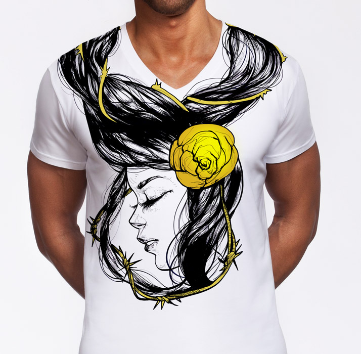
And here's she is all nice and fixed up ready for a poster. This process is much more difficult to explain because it's mostly trial and error, throwing layers and all kinds of stuff on top of each other until something pops out to me.
It's actually usually the funnest part!

Print is available here, and follow me on facebook to receive updates on when the shirt is available!
/ PRINT / FACEBOOK / TUMBLR /
New Print Released! - Time -


Time
In the blink of an eye,
time stands still.
Beauty frozen,
suspended in the arms of destiny…
...
HA! Yeah right.
Could you imagine if I was that corny for real? I did write that little sample though, so maybe there's some poetry writing in my future, not so heavy handed next time though.
I'm going to be releasing a few older pieces as prints finally, so stay tuned!
Also! use this link to get FREE SHIPPING on all prints worldwide until March 17!

Brawler Sailor Moon
I'm starting a series of hardcore, fight club style Sailor Scouts.Sailor Moon is up first, she's the leader, so she's the muscle. Nothing fancy, just straight up beating the shit out of the bad guys.
So this was the first version, Just getting the pose and everything down. It actually went by really quick, I had the whole image in my head from the start.

The next step was just going in real tight and just adding in more details and shine and just polishing it up overall. I actually tried adding more shading, but I ended up erasing most of because it was just unnecessary and didn't really add much to the piece.


The next part of the series is gonna be trying a color version of her, and an action scene. Then, after those the next Sailor up is Sailor Mars, her fire power is gonna be a lot of fun to play with.
Also both of them are available as prints all the way up to 28x38 inches!
Brawler Sailor Moon - Final / Brawler Sailor Moon - Sketch

HULK!
I loved The Avengers movie, it was a great summer blockbuster popcorn flick. Marvel has been killing it with their movies lately. I would've draw some Iron Man and Thor fan-art if I wasn't so scared of all the freaking details in their costumes. I'll get to them eventually, probably Loki too...
Anyways Hulk has always been one of my favorite characters, what's not to love about a super angry, giant green monster that is technically infinitely powerful? Plus, he's a blast to draw, there's so many different way to interpret him. You can really tell a lot from an artist depending how they draw the Hulk.
Personally, I think the movie got a great balance between comic booky and real life. I think the little gut he had in some scenes was a great touch, haha.
So, I wanted to start with a face study before i move on to tackling a full body or even a group piece. The red is because my eyes are started to get bored of just black and white. Plus, Hulk is ANGRY!

These 2 are me finally venturing out into adding full color into my inks. I feel the bold, bright colors are the only way to contrast with the heavy black in the inks.
Plus, I'm learning that I can't simply wait until I finish the inks before throwing the colors on. The best way would probably be wait until I'm half way through the inks, throw in some rough colors, and then finish both at around the same time. I think I started thinking about these colors in a bit too late. It's hard to switch mindsets when you feel a piece is almost finished.


All in all, learned a few new tricks for the next round. Expect more color pieces to pop up. Plus, I have some spare finished pieces sitting around I haven't posted yet.
Prints: Hulk-Red / Hulk-Neon / Hulk-Green

Batman + Inking Tutorial
Since I get this question pretty often, I'm going to go through the brushes I use for my digital inking and also go through the process of a piece from start to finish.
First off, the brushes. I usually only stick to 2 main brushes and use a mix of scratchboard and inking techniques. The first is just the plain old standard round brush which I use for all the drawing and detailing. The second is the round bristle brush in cs5 which I use for most of the crosshatching, texturing and shading.
One big thing to remember though is that the brushes are only half of it. The other half is getting into the Scratchboard/Inking state of mind. The trick to this is to be constantly switching between drawing with black and also white, pulling out the lights, pushing back the darks, and just playing with the values until you get a look or texture that you like.
It'll be easier to see and explain in the process shots.

Here's the first stage to any piece, the rough sketch. I noticed since middle school I just default to drawing Batmen since it's so fun, it just happens naturally and I can just shut off my brain and draw.

A plain profile shot against a solid black background felt too boring, so I threw down some rain lines.
At this point you want to start blocking out the main light and dark values, but you also want to play around and experiment as much as you want. Later on you can decide what elements you want to develop and and what parts you're just going to blot out. So it's pretty much a free for all.
Plus, towards the end it'll be easier to see what works and what doesn't.

Around this point I realized if I'm going to have him in the rain I should work in some water flowing down his mask, also it'll add an extra element for you eye to follow.
It's important at these early stages to start thinking what kind of flow your piece will have.

Here I'm just fleshing out the face and the mask and playing around with the water and splashes. Its starting to become a dance between making it too busy/overworked or plain/boring.

This stage is more clean up. Smoothing out the shadows and blacking out any stray marks that I feel don't add anything to the piece.
It's also important not to smooth everything out too much. You want to keep some of the freshness and spontaneity from the original sketch. It'll go a long way to making the piece feel alive.

Around this point I hit a wall. I kept working and working it. But it still was't looking how I wanted.
Moments like these are pretty common and I've always found that the worst thing you can do is to try and muscle through. You'll only end up frustrated or even worse, you'll ruin the piece. The best trick is to flip the image horizontally to see it in a new light or take a break to come back with fresh eyes. I did both and it did't work. So I used another trick.

I lasso tooled the jaw and mouth and started distorting it and playing with the proportions. Sometimes you have to listen to your instincts ad trust your eyes. I knew something was off, but it wasn't until I started moving things around that I finally saw that his face was too long.

And here we're at the final stages at last. I waited till the end to overlay some rain on top because you don't want to overload your eyes while your working with a piece thats too busy.

And here's the final piece after some tweaking, smoothing and lots of second guessing.

All in all, I hope this process helps some of you to play around. I realize the way I work is very messy and unorganized. And it's not for everyone, because it's even tough on me sometimes. Each layer and each stroke is a gamble. I look back on all these step and find myself wondering "Is the water too distracting? Is the rain on top too busy? Would the composition be stronger if the head was blacked out? etc, etc." In fact I almost prefer the version without the overlaid rain and water.
But, in the end you can listen to these little voices and always have doubts, or you can say "fuck it.", keep working, move forward and don't look back.
Because in the end, your choices are what makes your pieces unique.
Print: Batman-Rain
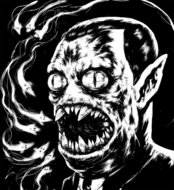
Marceline's Dad + Progress
Here's the fourth in the Adventure Time series, Marceline's Dad. I think I'll probably do a few more versions of him, maybe even a battle scene with Finn. He's just such a crazy character, even for a Show like Adventure Time. I mean he pretty much murdered everyone on his first appearance, Everyone. Sure they came back to life. But, still. Pretty Effed up.
I also managed to save some progress shots, something I'm trying to get in the habit of lately. I actually thought I had saved more for this guy. But once you really get in the groove, you kinda lose track of time and just go into autopilot. Now it's just a matter of training myself so that saving progress becomes a habit.
The initial sketch.

Progress and cleanup.

And after that I went straight to the final. But, as a bonus I also have a potential color experiment. Still not sure if this ones getting color, just gotta keep tinkering with it and trying different stuff.


Ice King

Continuing on with the Adventure Time series, I tried my hand at the Ice King. I was excited for him because he's one of the characters that I can actually push the details and really make him gruesome but still keep him true to the original.
I was a little unsure about making him blue since I like keeping my inks clean, but in the end I think it added more than taking away. Either way here's a copy of the black and white version.

The next two in the series are actually already complete, Jake and Marceline's Dad. Marceline's Dad has to be my favorite so far, I really went all out making him crazy scary. There's not really many characters in the Adventure Time universe I can go all out on without changing their actual base design.
Well, actually they aren't 100% complete. I'm trying to stick to this black and white + 1 color scheme to these pieces, and that's the point where I'm struggling to find out what works best.
Print: Ice King
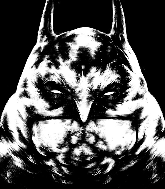


What time is it?
Finn the Human

Marceline the Vampire Queen

It was late one night and I just had an urge to draw Adventure Time, sometimes these things just happen and there nothing you can do about it.
I'm going to turn these into a whole series and see what I can do with the rest of the characters. I have a Scary, Demon Marceline in the works and have a few ideas for Marceline's Father and the Ice King. But, Princess Bubblegum is giving me some trouble right now so I may have to come back to her.
Both of these took one night each, so hopefully the rest go down that easy, too.
Finn City.


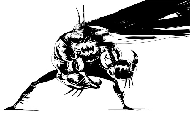
Judge Dredd

I've actually never really read much Dredd comics except on wikipedia, but his design and every piece of art with him has always been just so bad ass and iconic. It just hits you.
I even kinda enjoyed the old Judge Dredd movie, thankfully I was mostly oblivious to how badly they fucked up the actual character. But, at least it still looked cool.
I'm pretty hopeful for the new movie, the original creators read the script and said it actually tries to be faithful to the comic, so that's something. At least they already confirmed that he will not be taking off his helmet, which is basic stuff right there. Helmet looks a bit big for my liking... but we'll see.

Swamp Pig
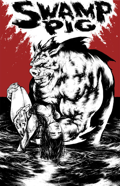
I completely forgot to post this piece, it was made around the same time as the pig cops and executioner piece.I remember I was keeping it secret because it was for a competitive blog project that is currently on hiatus until all of us trying to put it together get some actual free time to spend on it.
http://illvsill.blogspot.com/
So there will be updates on that eventually...
For this piece I chose as the assignment to make a comic book cover with the title "Swamp Pig". The cover had to incorporate a monster and a chick and the catch was it could only be black and white with one accent color. But, like I said we never got to the judging stage so I've just had the piece laying around.
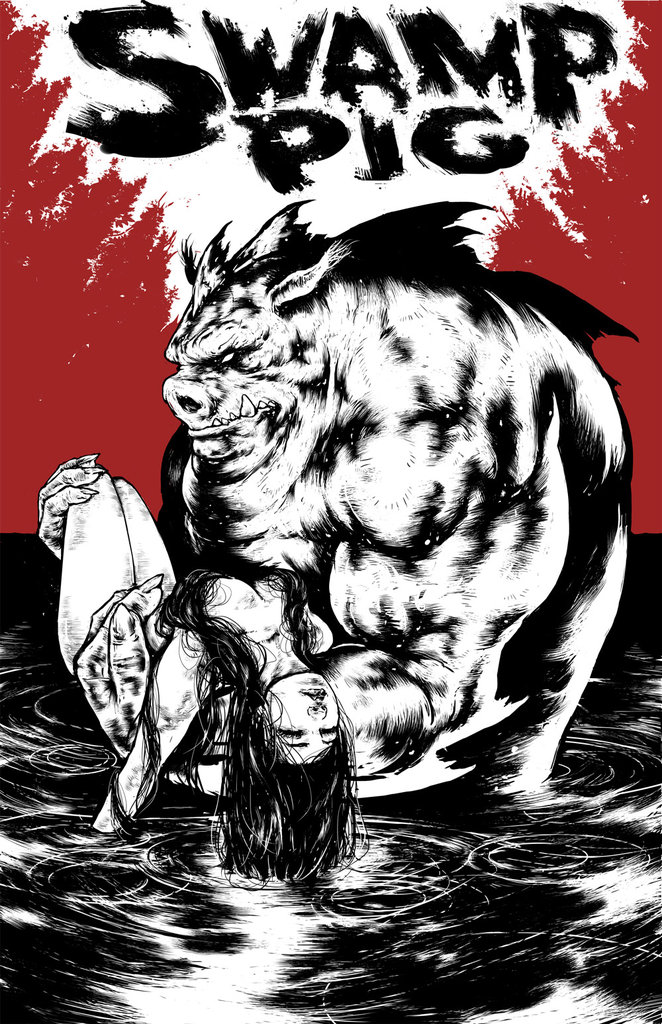
Obviously, since so much time has passed I'll have to think of a new challenge from scratch. I am glad I managed to get this piece out of that project so far. I got to play with making my own title from scratch and figuring out how to compose a comic cover.
I even can see the comic now, it'll be a mix between Sin City and Babe. Are you listening Image? I've got a blockbuster on my hands.
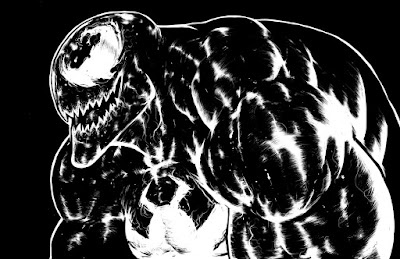
Inked Venom Final
Well, technically this version of venom isn't inked since it's all digital, but whatever.It was a lot easier to focus on the details and shape and form without having to worry about the color.

I tried out adding a color layer on top in Photoshop and I think it does the trick of adding a sense of color without taking away too much from the linework.

I'm going to have to experiment and see if this method will work on the other pieces that have this inking style as well.

President Xenu and Kif
This started as a doodle just for fun, but now I think I might use him for a bit of a larger project that will incorporate some nice design elements. I just wanted to draw a fun monster or old man or just something that I knew I could spend a good amount time just getting lost in the details. That's my favorite part just zooming in and wandering around, it's relaxing. My own form of meditation.Half way through this piece, it struck me that this alien looked really familiar...

It hit me that I made a realistic version of Kif from futurama, so I went ahead and added his signature little space suit and saved this version for fun.

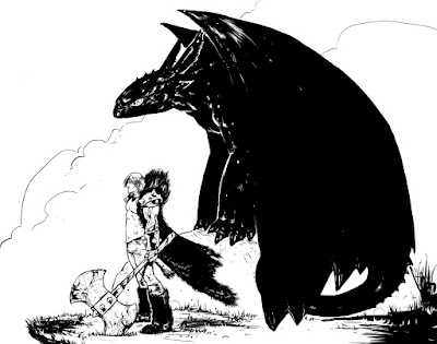
Hiccup and Toothless
Finished my take on Hiccup and Toothless from How to Train Your Dragon. I wanted to go with a more Frazetta/fantasy, epic feel. I mean after all it is vikings and dragons, plus I'm not too good with doing cute.My first idea was actually for a much bigger piece than this, but it ended up being trickier than I expected. So, this piece is more or less practice before I tackle the real thing.
Also I tried to keep the rendering a bit simpler on this one since I knew I wanted to color it from the start.


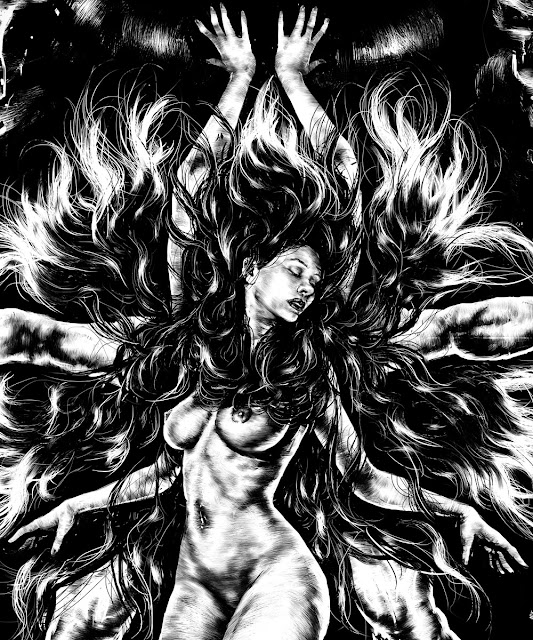
8 Armed Lady Final
Finally completed this piece. Just like I figured from the start it didn't really end up like what I originally saw in my head. But, that's what happens when you let the piece be in charge.All in all, it was a good experiment and it ended up being more of a stream of consciousness than anything else.


Current Progress: 8 Armed Lady
Now that most of the main elements are already in the piece, the next step is just refining, fixing and finishing.The biggest problems I still need to solve are some issues with her breasts and upper torso area. I also still need to see whats going to happen with that background. I like the direction it's heading in, but its still a long way from being finished.

Next post should be the final.