Posts

Furries
This was an assignment for computer illustration that was pretty much open to make any character designs. And it took me a while to figure what would be something really fun I could work on or something cool. It was a little tricky to think of a good idea since I'm not used to such open assignments.But finally I remembered that I always wondered if i could do some furry art and see if i could get away with turning it in as an assignment. It would also be a real challenge, taking something as terrible as furries and making it into something good.
This is the ink line work. Just a bunch of pens and microns and markers. I tried to keep the cross hatching and detailing minimal so i could let the color stand out more.

Then this one is the final. The colors are a lot more simple than what I originally wanted and i didn't put as much detail as i really could have. I'm also not wild about the background silhouette. I think i might go back into this one and polish it up some more eventually.


Lady Liberty
This was an Illustration assignment that was focused on being an editorial. He told us to find an issue we could investigate and develop an illustration that might accompany it like in a magazine or something.I didn't try to make mine too specific, but I think it reads pretty well. It's ink with digital coloring on top.

Also figure I'll post the processs work, since theres really nothing else I can do with them. And its also fun to see how much it changes from start to finish.
This here is the finished line work. There's all kind of ink in there. Brush pens, sharpies, microns, pentels and regular fine tip pen markers. I just throw in whatever I have.

And this her was the original composition and pose. Most people and the teacher felt the tablet was unnecessary and that the compostion would be stronger if it was more close up. And i made her lean forward more because it looked like it needed to be more obvious that she was stepping off the building.
It was also originally supposed to be an oil painting or acrylic. But the teacher wanted me to do more illustrations that look like my ink work, he said he liked the style i had going on in those better.

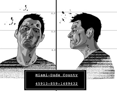
Digital Mugshot
This was for our Computer Illustration class, it was an assignment to learn how to use illustrator. All we had to do is make a portrait. I always wanted to do a mugshot type self portrait so I figured this assignment was as good as any to go ahead and try it.It came out pretty much how i wanted, even though I wanted to do color but I ran out of time. Either way black and white seems to look more authentic and like it was a file photo.
I'll probably go back into it soon and add more detail to make it more gritty and less digital and smooth.


Some new stuff
This was an illustration assignment of designing a book cover. I decided to go with Stephen King's The dark Tower, mostly because I could think of alot of cool imagery and interesting stuff I could associate with it.My orginal idea had the bottom part of the gun being just a silhouette made up of a pile of dead bodies. Like in this sketch.

But the teacher said it was too gruesome for a book cover and it was unnecessary or something. I still stand by it, it would have looked so good, and one of the major parts of the story revolves around the main character having to massacre a whole town that had turned against him. So it tied in with the story. But whatever.
Heres the final painting.

And here it is with some sample text.

I have about three more assignments I'll be posting up real soon.

