Posts
Showing posts from 2008
Dexter Book Cover + GIC
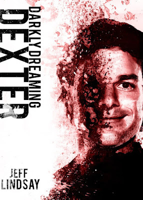
This was an assignment for Computer illustration. It was real simple we just had to pick a book and make a cover. I chose dexter because it's such a good show and I figured I could get away with making it really simple and graphic.
I was originally going to have it more drawn rather than photoshopped. But, I ended up running low on time and it wasn't looking how I wanted. So I ended up going this direction with it.
I figured since this was a mostly a Graphic Design project I'd go ahead and post some of my other GIC stuff from last year. These were some fun assignment for the Museum of Modern Art where we had to design some posters using only text for the composition and content.


illest of ill timelapse
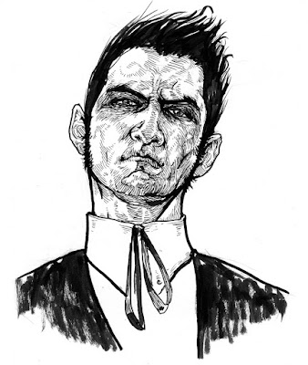
This drawing was done on short notice for an art show set up here at the school called Illest of Ill. They were taking timed photographs of us while we drew so they could speed up the process and show it on a television during the show.The theme for the show was the Gibson girl and Arrow collar man. They were really famous illustration icons from the early 1900's. So I decided to do something with that in mind and all I had on me was the reference I had from my mugshot self portrait. So I just used that as a base for an angry Arrow collar man. It's funny seeing two pieces drawn from the same reference.

Walken
This illustration was for an assignment where we had to take a pop icon and caricature them with an animal to represent them. The animal was just a conceptual part of the piece, a problem to solve. The animal could be similar, ironic, or just something that accentuates the person.I chose Christopher Walken because he would be really easy to caricature and the the chameleon became a good choice since i decided to accentuate Walken's eyes. Also Walken is kinda creepy and crazy and I think a reptile suits him well. Also he's a good actor and chameleons are good at camouflage, so it fits.

This was the final sketch before I started on the final. I didn't really bother finishing it that much because I had the idea already worked out in my head. I just drew it out on a canvas panel did a rough layer of acrylics and went over that with black paint and markers. I wanted this piece to feel more like a drawing than a painting.

Furries
This was an assignment for computer illustration that was pretty much open to make any character designs. And it took me a while to figure what would be something really fun I could work on or something cool. It was a little tricky to think of a good idea since I'm not used to such open assignments.But finally I remembered that I always wondered if i could do some furry art and see if i could get away with turning it in as an assignment. It would also be a real challenge, taking something as terrible as furries and making it into something good.
This is the ink line work. Just a bunch of pens and microns and markers. I tried to keep the cross hatching and detailing minimal so i could let the color stand out more.

Then this one is the final. The colors are a lot more simple than what I originally wanted and i didn't put as much detail as i really could have. I'm also not wild about the background silhouette. I think i might go back into this one and polish it up some more eventually.

Lady Liberty
This was an Illustration assignment that was focused on being an editorial. He told us to find an issue we could investigate and develop an illustration that might accompany it like in a magazine or something.I didn't try to make mine too specific, but I think it reads pretty well. It's ink with digital coloring on top.

Also figure I'll post the processs work, since theres really nothing else I can do with them. And its also fun to see how much it changes from start to finish.
This here is the finished line work. There's all kind of ink in there. Brush pens, sharpies, microns, pentels and regular fine tip pen markers. I just throw in whatever I have.

And this her was the original composition and pose. Most people and the teacher felt the tablet was unnecessary and that the compostion would be stronger if it was more close up. And i made her lean forward more because it looked like it needed to be more obvious that she was stepping off the building.
It was also originally supposed to be an oil painting or acrylic. But the teacher wanted me to do more illustrations that look like my ink work, he said he liked the style i had going on in those better.

Digital Mugshot
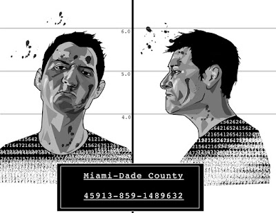
This was for our Computer Illustration class, it was an assignment to learn how to use illustrator. All we had to do is make a portrait. I always wanted to do a mugshot type self portrait so I figured this assignment was as good as any to go ahead and try it.It came out pretty much how i wanted, even though I wanted to do color but I ran out of time. Either way black and white seems to look more authentic and like it was a file photo.
I'll probably go back into it soon and add more detail to make it more gritty and less digital and smooth.

Some new stuff
This was an illustration assignment of designing a book cover. I decided to go with Stephen King's The dark Tower, mostly because I could think of alot of cool imagery and interesting stuff I could associate with it.My orginal idea had the bottom part of the gun being just a silhouette made up of a pile of dead bodies. Like in this sketch.

But the teacher said it was too gruesome for a book cover and it was unnecessary or something. I still stand by it, it would have looked so good, and one of the major parts of the story revolves around the main character having to massacre a whole town that had turned against him. So it tied in with the story. But whatever.
Heres the final painting.

And here it is with some sample text.

I have about three more assignments I'll be posting up real soon.
Some Leftovers
Found some stuff I never got around to putting up anywear for some reason.This was for a pen and ink assignment we had to do on an animal. Every one was doing bears and fish and sharks and turtles. And I thought wouldn't it be funny if I did a pokemon.
The teacher just though I came up with some weird sea serpent. I think someone did rat me out in the end though, but the the teacher still didn't know or care what pokemon was. Good times.

This is another pen and ink drawing. This one is exactly like what the media teacher wanted, except I did this for a Graphic Design assignment.
It's half digital, since I cleaned up the lines in illustrator.
 This one was the line art of the cover for a comic I made for my comics class.
I don't want to get into the what the story was. But, I pretty much thought up the most ridiculous story I could get away with that would let me draw some awesome stuff.
There were many times the teacher asked if I had lost my mind for wanting to go through with such a stupid idea. I had a vision dammit!
 Here's the final cover. I kind of rushed it since i was left with about a weekend to finish up all my pages and the cover. Procrastination is a bitch.
But, I knew well enough to focus most of my work on the cover since i needed at least one thing to stand out. And i didn't feel my pages were that good.
In the end the cover was the main thing that sold my idea to the teacher.

Old Killers
This was an Illustration assignment to make a poster for a play. The play I chose was about 3 murderers living in a retirement home and they each tell their story.So I chose a simple, graphic approach. But in the end it didn't really come out too graphic.
Originally I forgot to add the one into the painting, becuase i started to like how much it looked with out her. But, in the end she had to be part of it since the play was about 3 murderers, not 2.

This was how the painting was supposed to turn out. I just got rid of the lady with Photoshop. I think it works a lot better like this.

Huge Ass Fucken Update Part 2
These are two special pieces I did during winter break. I just really wanted to learn more about painting and just went into these trying out anything I could.They're actually done in a really unorthodox way, with acrylic going over the oil. Usually artists do oils over acrylic. But they did serve their purpose and I learned a lot.


This next one is another from media class. This technique is called "Every Hair on the Dog" we basically make the most detailed pencil drawing we can and go over it in thin washes of acrylic to add color but keep all the details.

Huge Ass Fucken Update Part 1
So I have a lot of old school assignments i still haven't posted. I'll try to set them up by class and media I guess.These were done in media class learning watercolor techniques. I actually have a few more of these since they were really fun and easy to make. Most haven't been scanned yet though.

 This one was a done in scratch board and was also fun, even if it was kinda tedious. It also made it into one of the student shows called "Illest of Ill", it shows off select work from the Illustration majors.
The smoke was added in digitally. Some called it cheating, but a teacher once told me that other artists will use any tricks they can to beat us, so we have to do the same.


